
Flex Brand Refresh
Client: Flex Insurance
Sector: Insurance
Role: Senior Designer
Sector: Insurance
Role: Senior Designer
The Brief
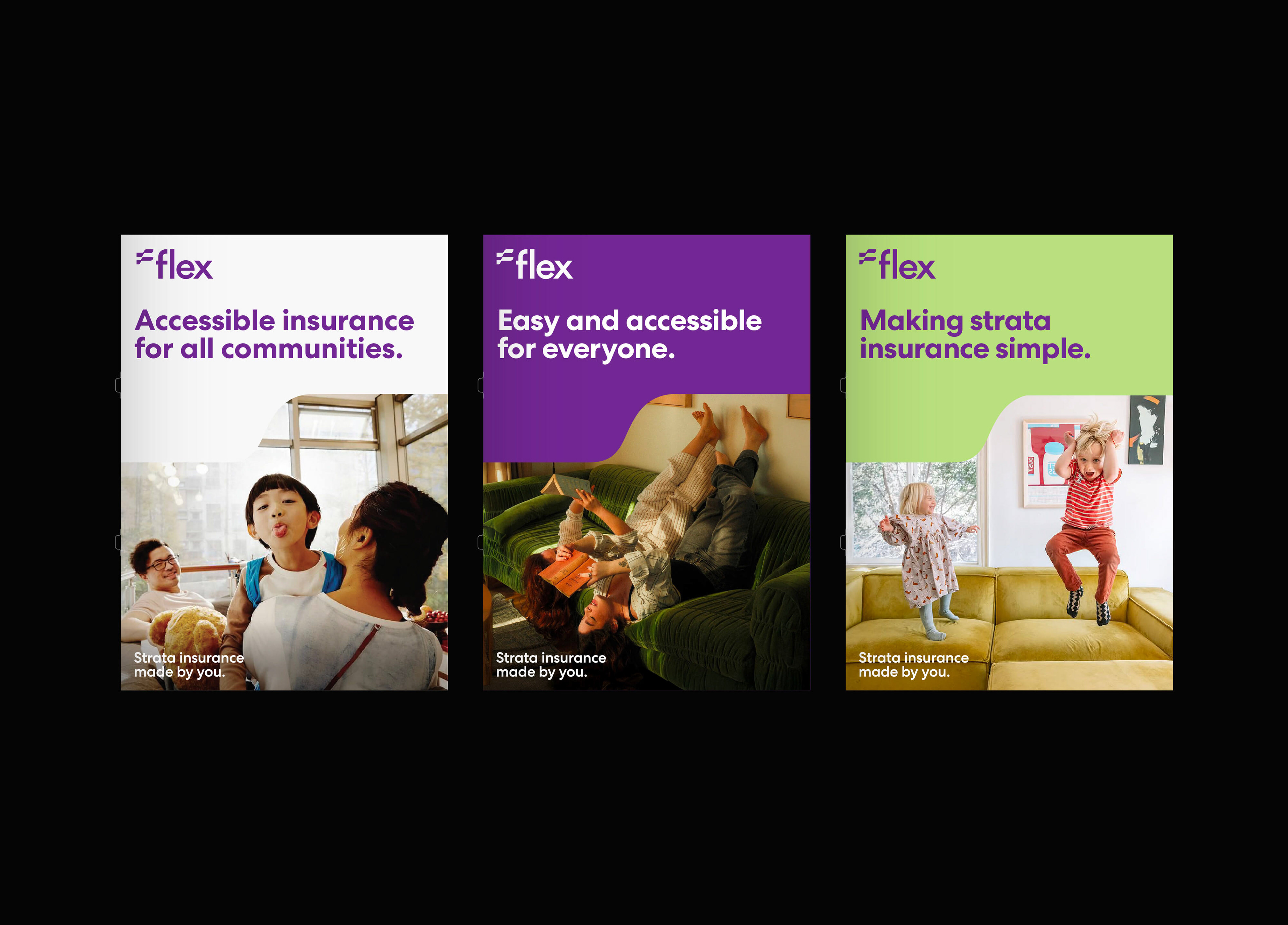
Flex needed to evolve its brand to reflect its commitment to flexible, accessible strata cover for communities and brokers. As lead designer, I re‑imagined the visual identity from the ground up.
Flex needed to evolve its brand to reflect its commitment to flexible, accessible strata cover for communities and brokers. As lead designer, I re‑imagined the visual identity from the ground up.
The Approach
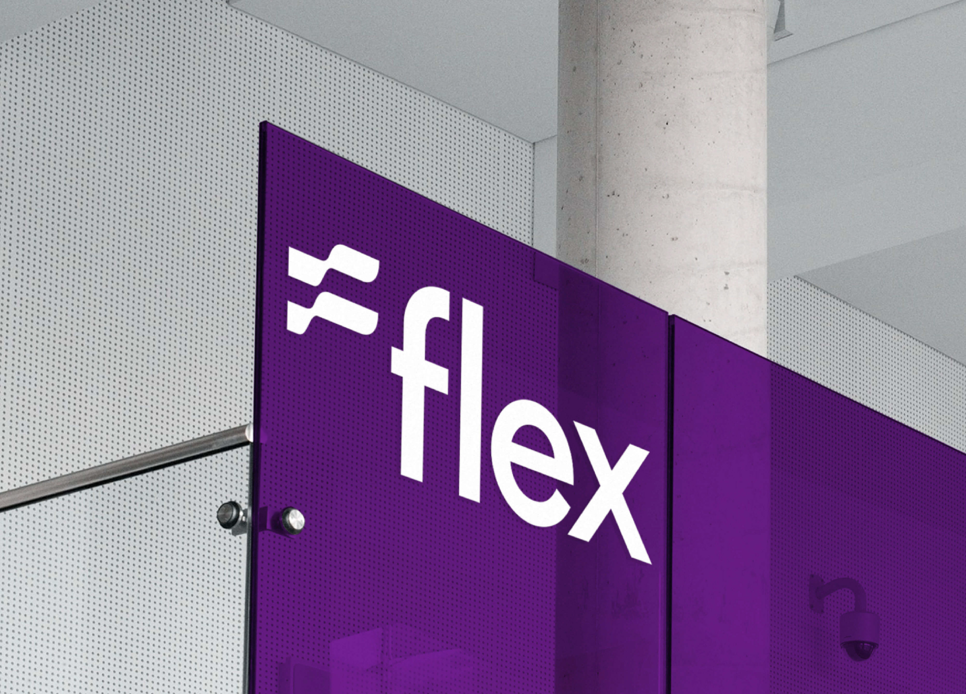
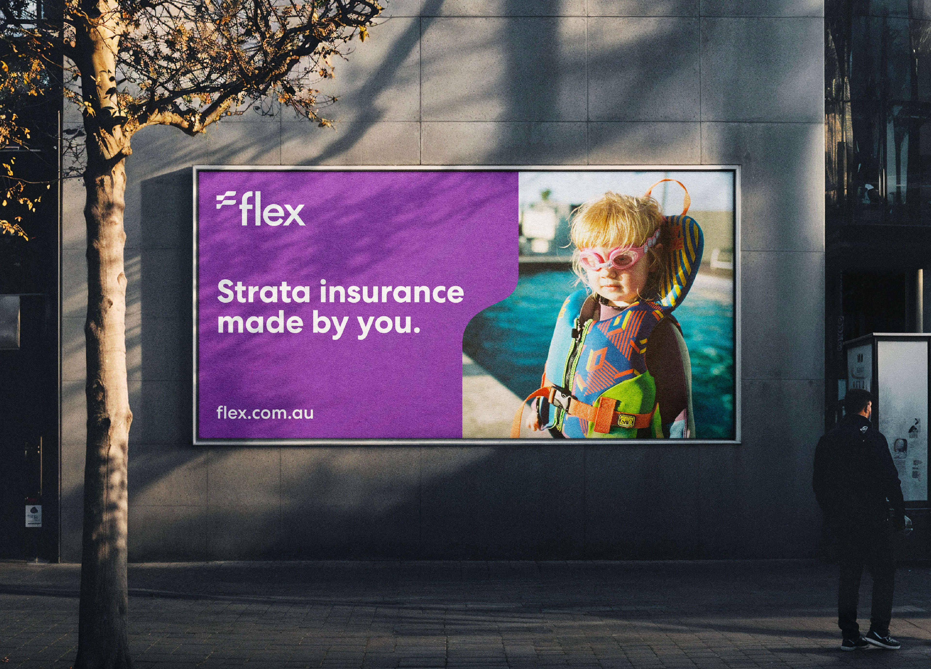
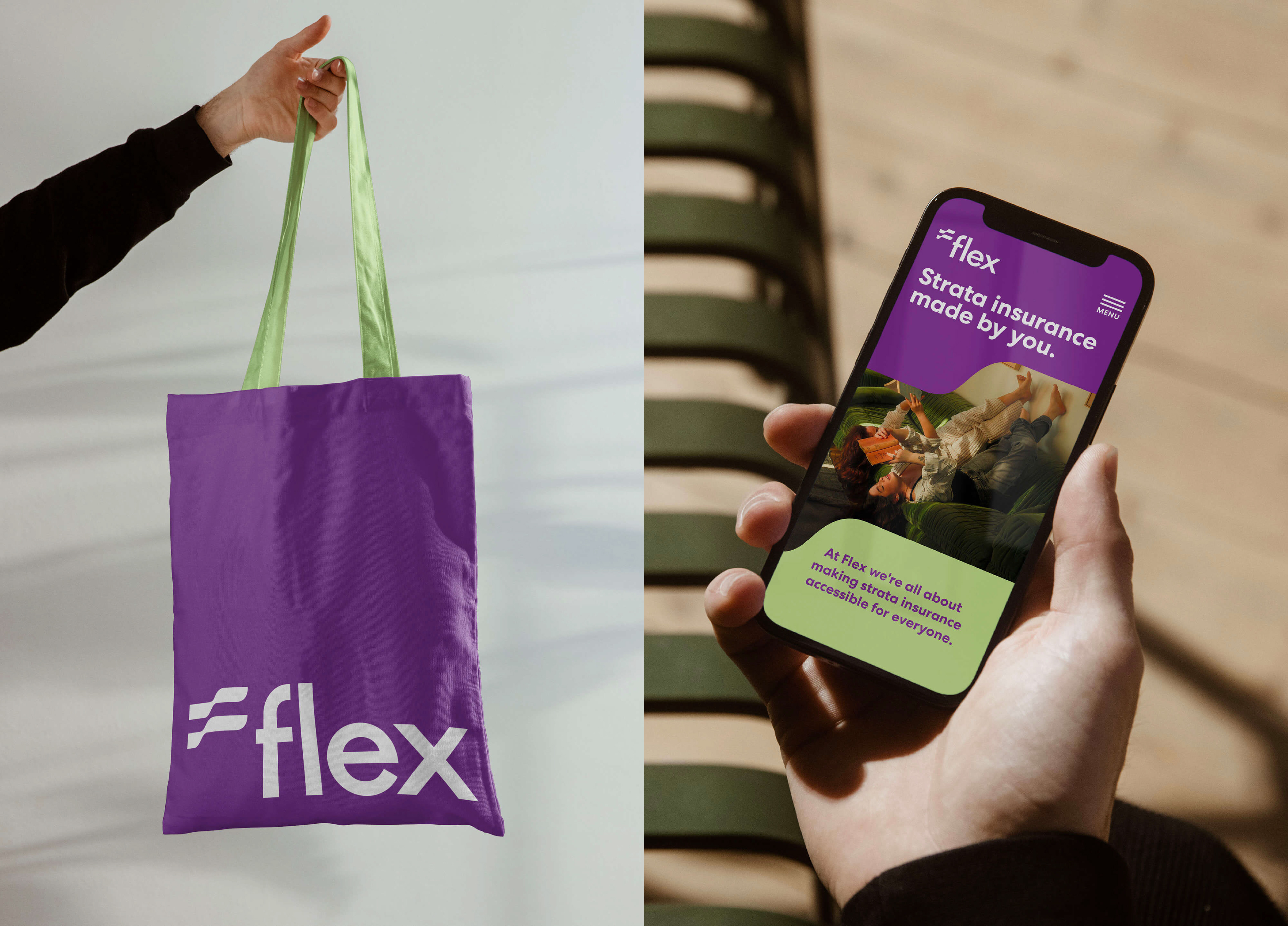
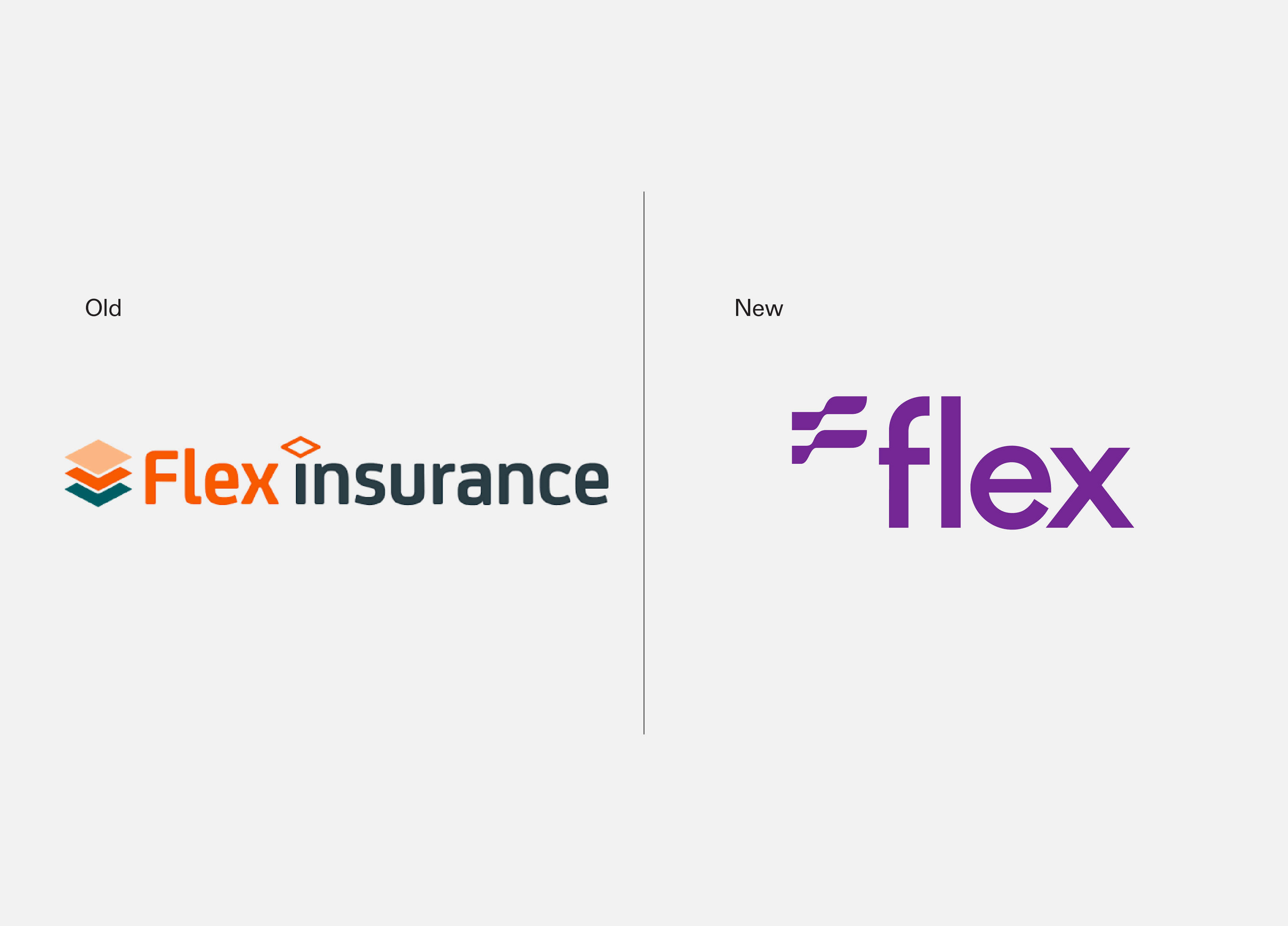
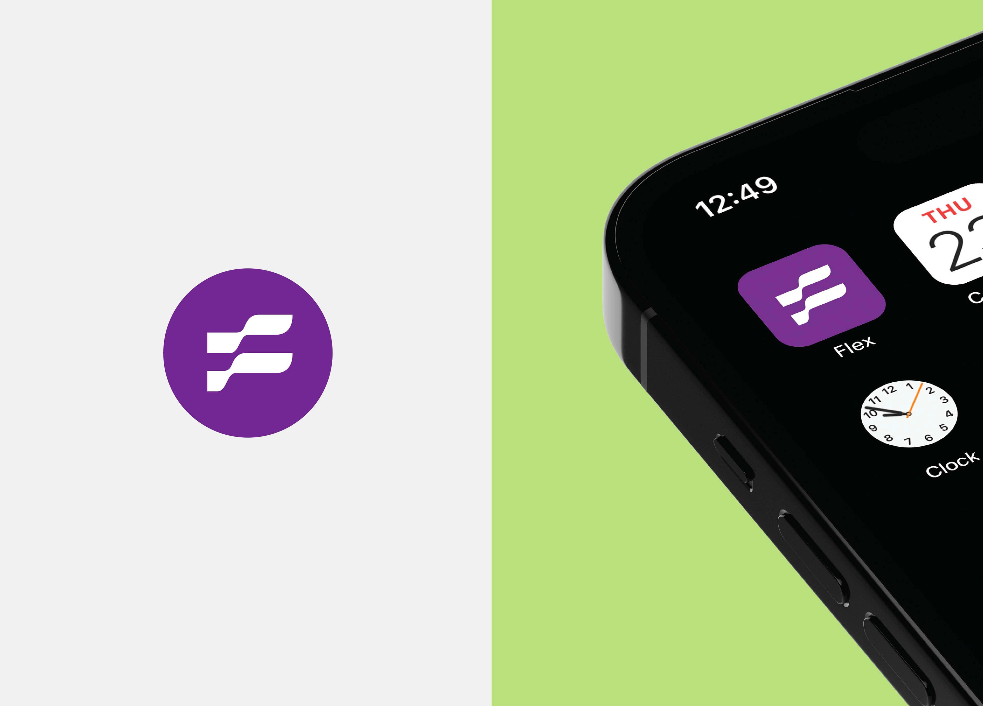
I created a fresh visual system grounded in movement and modularity. A dynamic “F” mark suggests flow and adaptability. I paired that with a bold purple tone, clear typography, and a layout system designed to work across print and digital, helping the brand feel both bold and human.
I created a fresh visual system grounded in movement and modularity. A dynamic “F” mark suggests flow and adaptability. I paired that with a bold purple tone, clear typography, and a layout system designed to work across print and digital, helping the brand feel both bold and human.
The Result
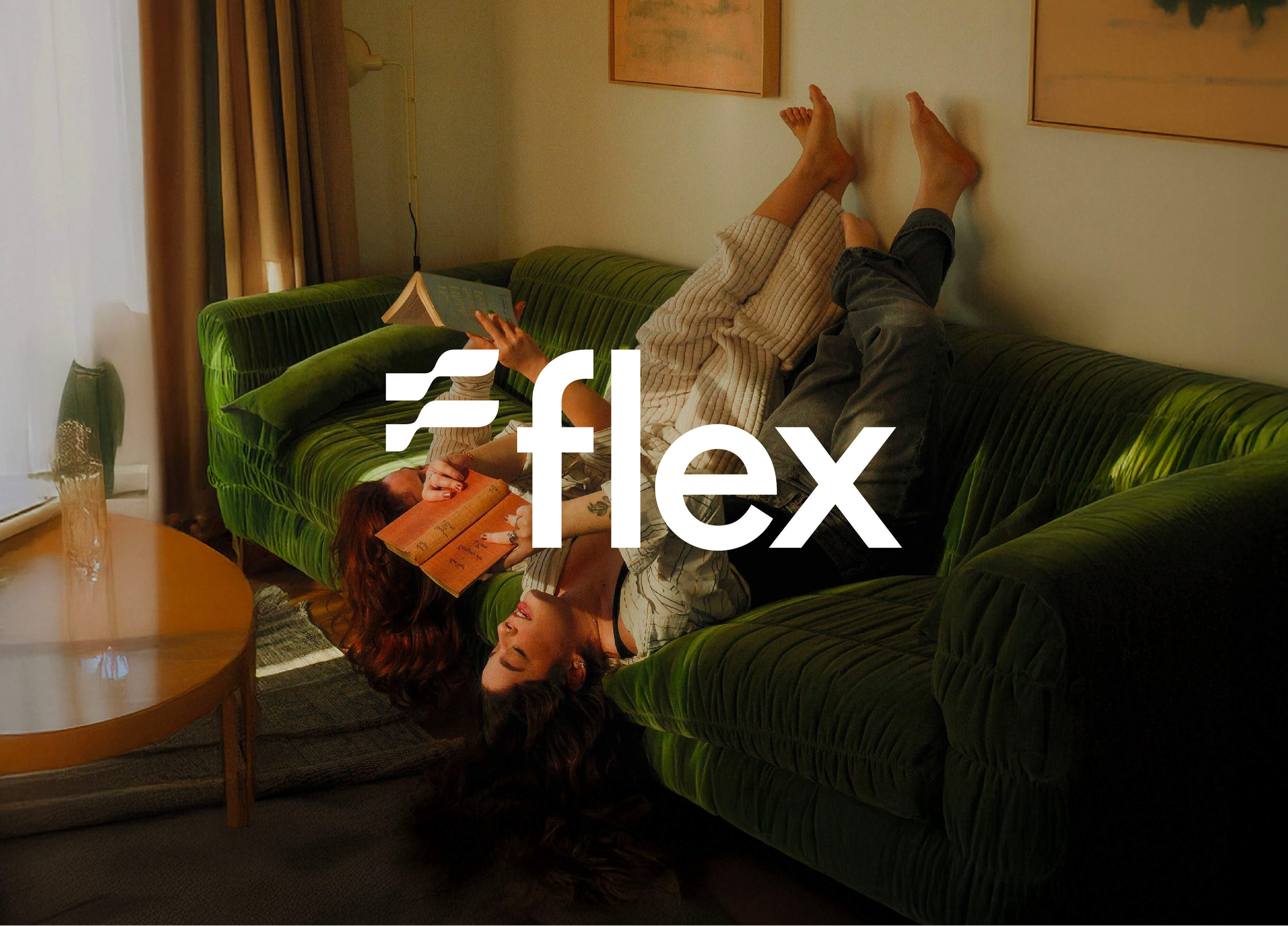
The refreshed Flex brand landed with clarity and purpose — ready for growth, choice and community‑driven cover. It now speaks with confidence and warmth to both brokers and strata customers.
The refreshed Flex brand landed with clarity and purpose — ready for growth, choice and community‑driven cover. It now speaks with confidence and warmth to both brokers and strata customers.
Produced at BrandMatters (now Fuller). All rights reserved.