
Piccadilly Valley Wine
Client: Family-owned Wine Brand
Sector: Food & Beverage
Role: Head of Design
Sector: Food & Beverage
Role: Head of Design
The Brief
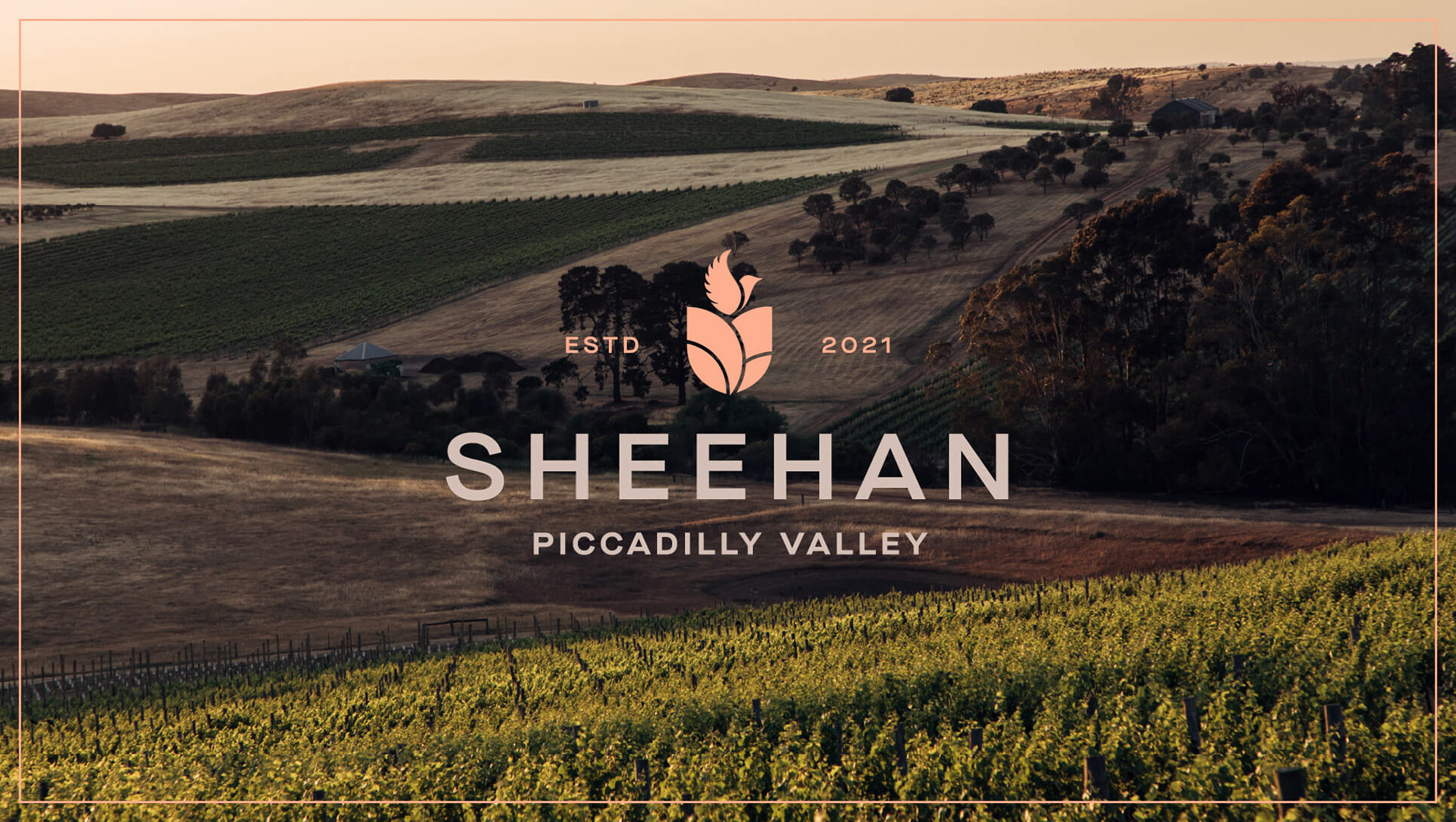
The owner of four vineyards in South Australia’s Piccadilly Valley approached us to help create a name and visual identity for a new premium wine brand that would honour the land and his family heritage.
The owner of four vineyards in South Australia’s Piccadilly Valley approached us to help create a name and visual identity for a new premium wine brand that would honour the land and his family heritage.
The Approach
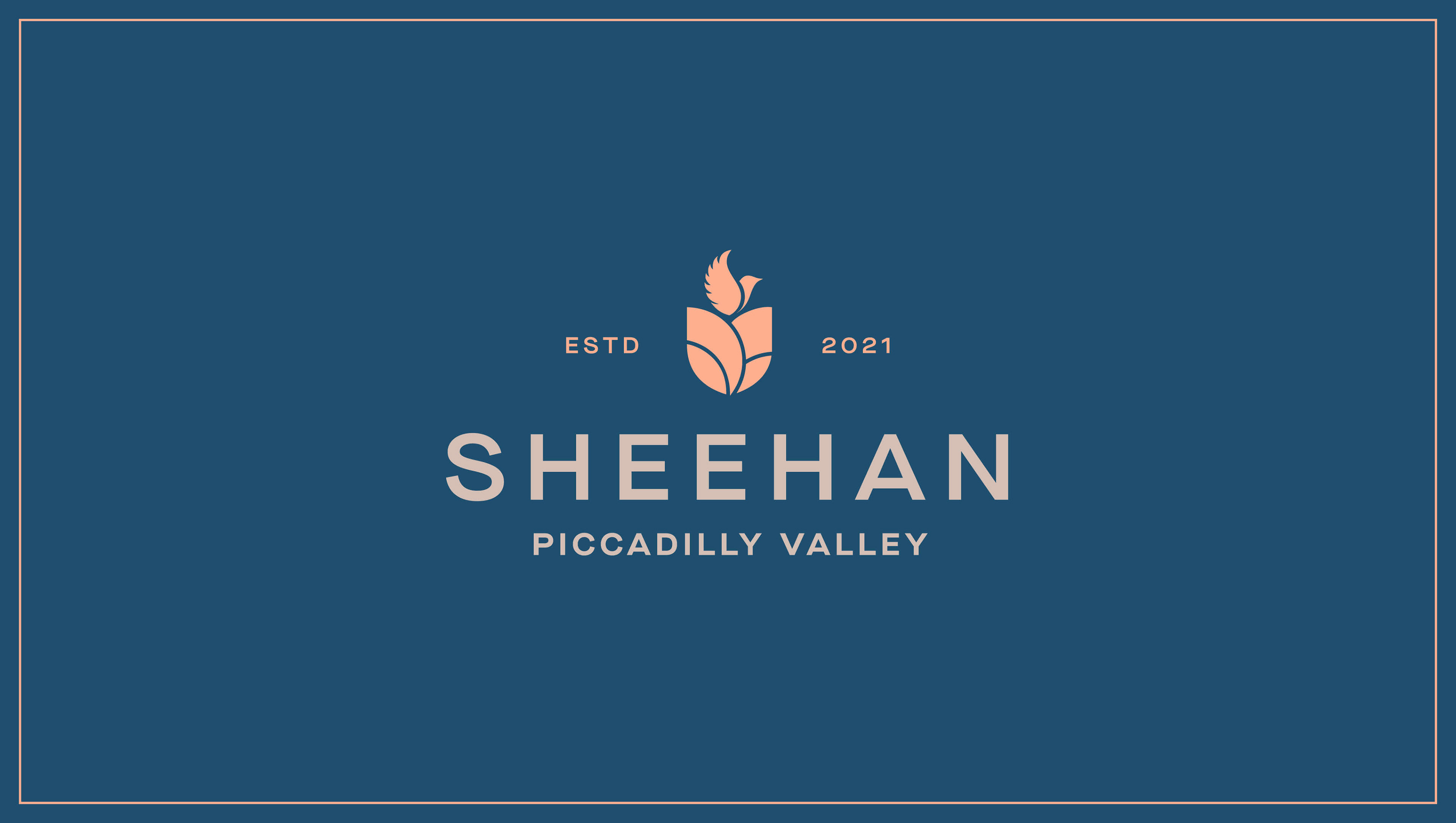
Drawing on the vineyard’s serene landscape and the family name’s etymology — meaning “the peaceful one” — we created a brand identity that balances elegance with restraint. The dove symbol represents peace and legacy, while the custom crest captures the rolling contours of the Piccadilly Valley. Soft, earthy tones and refined typography were chosen to reflect the brand’s connection to place and quality-driven ethos.
Drawing on the vineyard’s serene landscape and the family name’s etymology — meaning “the peaceful one” — we created a brand identity that balances elegance with restraint. The dove symbol represents peace and legacy, while the custom crest captures the rolling contours of the Piccadilly Valley. Soft, earthy tones and refined typography were chosen to reflect the brand’s connection to place and quality-driven ethos.
The Result
A quietly confident identity that positions the brand for future growth, while offering a deeply personal nod to family and land.
A quietly confident identity that positions the brand for future growth, while offering a deeply personal nod to family and land.


Produced at BrandMatters (now Fuller). All rights reserved.